Pendant cord color matching starts by reading your room’s dominant and accent hues, then choosing natural-fiber cords in harmonizing or gently contrasting shades, balancing texture, sheen and thickness with fixture style; if store options fall short, DIY dyeing or wrapping techniques and a quick daylight/nightlight checklist ensure a flawless fit.
Advertisement
pendant cord color matching may sound like a tiny detail, yet it can quietly transform the room’s vibe. Curious how to nail that harmony without fuss? Let’s untangle the options together.
decoding color psychology in lighting
Color psychology guides how light feels in a room, and the pendant cord you choose can tilt that mood. A burnt orange cord releases cozy, sunset warmth that softens hard edges. In a reading nook, that small glow can encourage longer, calmer stays.
Warm hues spark energy
Red or terracotta cords pair well with walnut furniture and mid-century Scandinavian lighting. Their subtle ember tone stimulates conversation zones like dining tables. Keep walls neutral so the cord, not the paint, carries the excitement.
Cool shades invite focus
Deep navy or forest green cords quiet the eye and reduce visual noise. Mount them above a workstation or craft table to aid concentration. Match the cord to accent pillows for a low-key, Danish lamp evolution vibe.
Neutrals create balance
Charcoal, sand, and clay cords act as color chameleons. They borrow warmth from nearby wood yet stay crisp against white ceilings. Use them when you want the pendant’s form—not its color—to headline the design heritage story.
Advertisement
When testing a cord, dim the bulb and scan the room. If shadows feel inviting rather than stark, the psychology is working in your favor.
assessing your room’s existing palette

Begin with a quick scan: what color jumps out first? Call it the dominant shade. Walls, a large sofa, or a bold rug often hold this spot. Note the hue and its intensity.
Map supporting colors
Look for two or three tones that appear in pillows, artwork, or trim. These secondary accents guide how bold a cord can be. List each one and rank them from most to least visible.
Spot hidden undertones
White paint may lean blue, and taupe can hide pink. Hold a clean sheet of printer paper next to surfaces to reveal subtle undertones. Matching a cord to these keeps the room from feeling off.
Factor in light temperature
Daylight casts cool blues; Edison bulbs add amber warmth. Observe the room at breakfast and after sunset. If the palette shifts, choose a cord that bridges both moments, like muted graphite or soft clay.
Snap a photo and overlay digital swatches to test options before you buy.
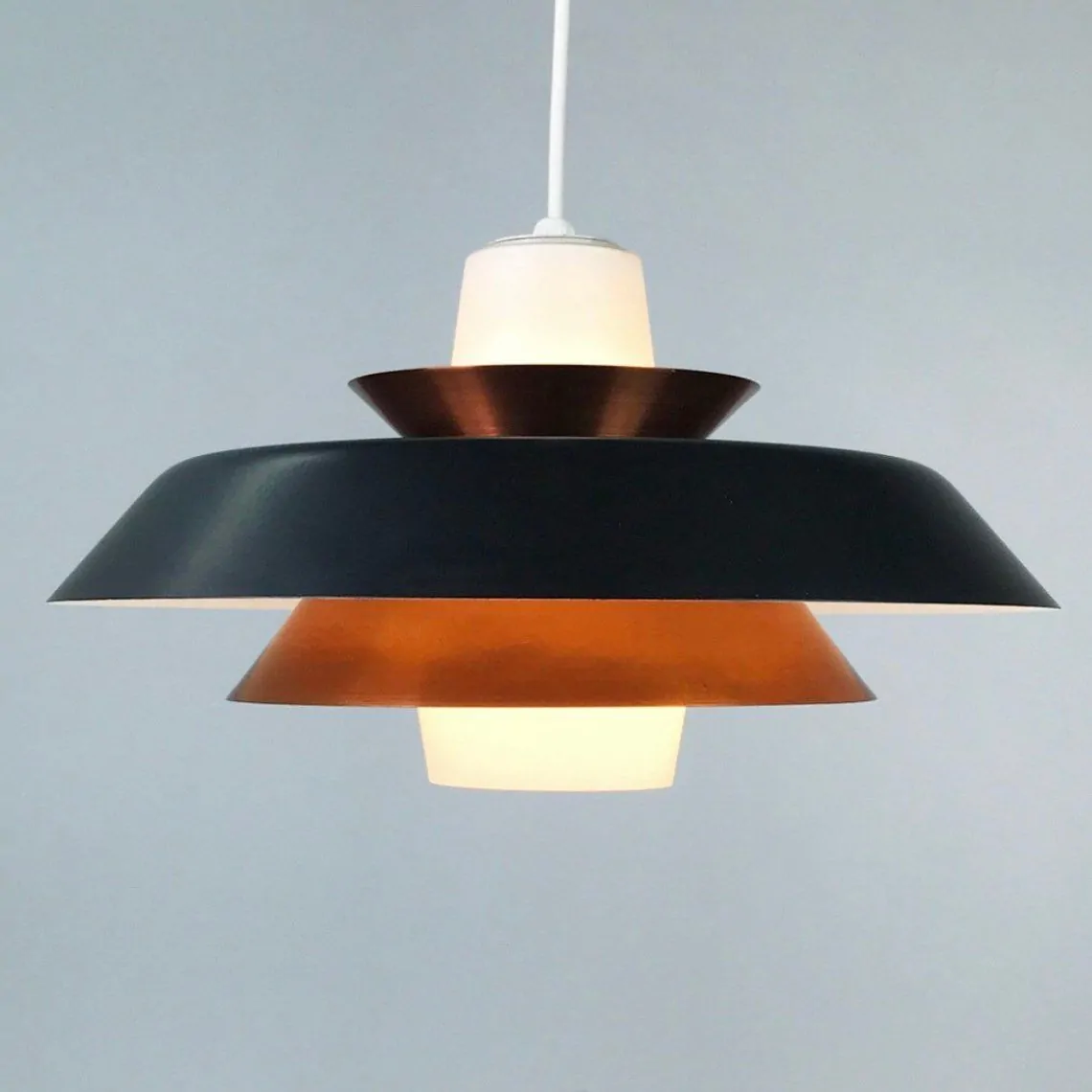
choosing cords for mid-century scandinavian lighting
Mid-century Scandinavian pendants favor clean lines and soft light. A cord that feels handmade amplifies that calm look.
Choose natural fibers
Swap shiny plastic for cotton, linen, or braided jute. These textures echo the oak tables and wool rugs common in Nordic homes. A matte cord will also cut glare around the canopy.
Lean into muted colors
Sage green, mustard yellow, and dusty charcoal mirror the era’s earthy palette. They add interest without shouting. Test each shade against your wall paint; the goal is gentle contrast, not a jarring pop.
Mind the hardware
A brass socket warms up mustard or rust cords, while brushed steel cools sage and slate options. Match metal finishes across door handles and chair legs for a tight, design heritage thread.
Check thickness and drape
Mid-century fixtures are slim, so a lean 18-gauge cord keeps proportions right. Let it hang in a soft curve rather than pulled straight; the slight bend feels relaxed and human.
Before installing, dim the bulb. If the cord’s color still reads true under low light, you have a keeper.
balancing texture, sheen and shade depth

A cord’s finish changes how its color shows. Texture comes first. Matte cotton drinks light, making pigments look soft. Satin nylon reflects more, so the same hue feels brighter. Braided leather adds tiny shadows that deepen darker tones.
Sheen shifts mood
Low-sheen cords, like linen, calm busy spaces because they scatter glare. High-gloss PVC pops in minimalist rooms where every highlight counts. Balance by matching cord sheen to nearby surfaces—dull against glossy tiles, shiny beside raw wood.
Play with shade depth
Light tints open a ceiling and draw eyes up. Dark shades ground a pendant and hide dust. Pair a pale cord with a heavy metal shade for contrast, or choose charcoal on a white canopy for a sleek line.
Hold a sample under your actual bulb. If the color shifts too much, tweak sheen or depth until the look feels right.
diy dyeing and wrapping techniques for custom cords
Begin with a plain cotton or linen cord. Remove the socket, tape the plug, and wash the sheath to strip factory sizing; clean fibers grab color better.
Stovetop dye bath
Fill a stainless pot with hot water, fiber-reactive dye, and a spoon of salt. Slide the cord in and stir for ten minutes. Rinse until water runs clear. The result is a bold, even hue.
Gradient dip-dye
Hang the cord over the pot and lower only the bottom foot for three minutes. Drop another section every minute. Each pause deepens the tint, creating a smooth fade from light to dark.
Colorful yarn wrapping
Dry the cord, dab craft glue near the canopy, and wrap embroidery floss in tight coils. Swap colors for stripes or stick to one tone for a clean look. Finish with heat-shrink tubing so strands stay put.
Spiral macramé cover
Use two 2 mm cotton ropes. Tie half-knots down the line, flipping colors every five knots. The twist adds texture and hides minor stains.
Seal any dyed or wrapped section with a thin coat of beeswax. Let it cure overnight before rewiring the pendant.
quick checklist to avoid common mismatches
Stand at eye level with the pendant site and list the three loudest colors you see. This snapshot will guide every cord choice.
Quick test steps
- Daylight match: Hold a cord sample beside walls at noon. If the hue looks dull, shift two tones up the paint strip.
- Nightlight check: Repeat under the bulb you will use. Glare means the sheen is too high; swap for matte.
- Metal harmony: Compare socket finish with door handles. Mismatched metals make even perfect cord colors look wrong.
- Texture balance: Pair rough cords with smooth shades, and glossy cords with raw wood to avoid competing surfaces.
- Accent echo: Echo one small décor piece—like a throw pillow—for instant cohesion without repainting.
- Dust test: Rub chalk on a dark cord; if it clings, choose a lighter tint that hides lint better.
Tick each box before checkout to dodge costly returns.
Light up your space, not your worries
Matching your pendant cord to the room’s palette is easier when you know what to check. Start with color psychology, then study the shades already living in your home.
Pick natural fibers and muted tones for mid-century Scandinavian fixtures. Balance texture, sheen, and depth so the cord feels right in any light. If off-the-shelf options fail, grab a dye pot or yarn and craft your own look.
Run through the quick checklist before buying. Test in daylight and at night, echo one accent, and watch dust on darker cords. A five-minute review can save hours of returns.
With these steps, your pendant cord won’t just hang; it will sing in perfect harmony with everything around it.
| Factor | Guideline | Benefit |
|---|---|---|
| Room Palette | Match cord to dominant or accent hues | Creates visual harmony |
| Material | Choose natural fibers like cotton or linen | Enhances texture and complements Scandinavian design |
| Color Temperature | Select cord colors that bridge daylight and evening tones | Maintains consistent ambiance throughout the day |
| Hardware Finish | Coordinate cord color with socket and canopy finishes | Ensures cohesive fixture appearance |
| DIY Options | Consider dyeing or wrapping cords for custom colors | Allows personalized design solutions |
FAQ – Pendant cord color matching and interior palettes
Why does the cord color matter in lighting design?
The cord sits in your sightline and can shift a room’s mood, echo accent colors, or distract when mismatched.
How do I pick a cord color that fits my existing palette?
Identify the dominant and secondary room colors, then choose a cord that either echoes an accent shade or offers gentle contrast.
Which cord materials work best with mid-century Scandinavian pendants?
Natural fibers like cotton, linen, or braided jute pair well with the era’s warm woods and matte finishes.
Can I dye a pendant cord at home safely?
Yes. Remove hardware, use a fiber-reactive dye in a stainless pot, rinse thoroughly, and let the cord dry before rewiring.
How do texture and sheen affect how a cord’s color looks?
Matte textures mute hues, while glossy finishes intensify them. Match sheen to surrounding surfaces to keep the look balanced.
What quick checks prevent mismatches before purchase?
Test the cord sample in daylight and bulb light, compare metal finishes, balance texture, and run a dust test on darker cords.